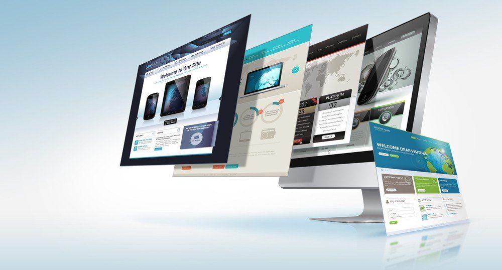
How to Properly Design a Website
Your website is your business’ face in the online world, so why not make it a pretty one? There are many elements to website design – and if you’re not a website designer, chances are there are a few things you might have overlooked. As you start to design your own business website, keep these design tips and strategies in mind.
Steps to Designing the Perfect Business Website
Start with the Home Page
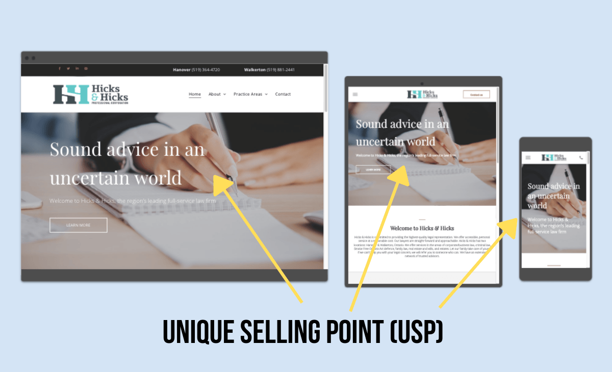
The home page of your website needs to be inviting. It needs to be attractive, but also fully functioning, with the ability to direct users. When a user first clicks onto your website, they typically go onto the home page first. A user wants to see a simple, but attractive design that captures their eyes. Of course, the page needs to lead with your unique selling point (USP). Your USP is what draws in search results and online users, and it's going to get the right type of client to your website. Once you find your unique selling point, you can then begin to build your website around it.
A user will typically look for more information once they get to your home page. Depending on your industry, they could be looking for clarification on services offered, products and specifications, answers to popular questions, or the best way to contact you. Your home page should contain snippets of information that lead to additional pages of your website (internal linking).
About Us Page
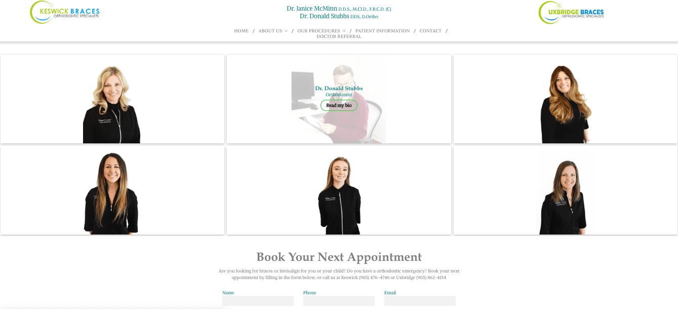
The About Us page is the second most important page on your website. When a user is ready to become a client, they want to get to know you. An about us page should be detailed and inviting – this is your time to shine! The page should be true to you and the brand you're creating, think design, photography, and description. The about us page is where you can share your story, how you got started, your education, passions, shortcomings, everything that’s unique about you and your business. Having a good description of who you are will humanize your business to the user. You will become a familiar face instead of a company name.
If there are commonly asked questions about your business, you might want to consider adding a frequently asked questions page. It may help increase the number of ready to purchase clients in your office.
Contact Page
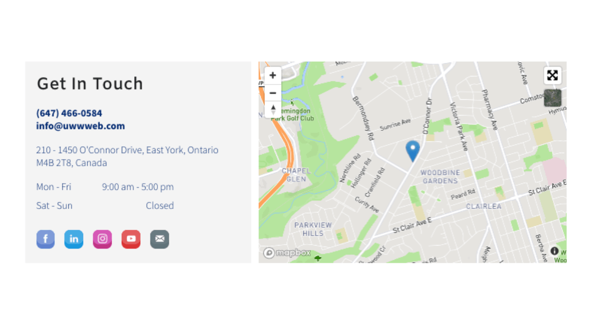
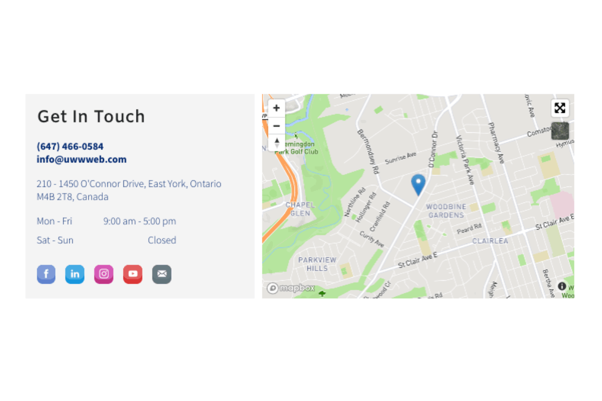
So, you’ve wowed them, now it’s time to bring it home! After your website users have learned more about you, they’ll be ready to contact you! Your contact page needs to be easy to find, accurate, and contain only contact information. The contact page design is very simple and straight forward.
It needs to contain:
- Your Business Address(s)
- Mailing Address
- Email Address
- Phone Number
- Fax Number
- Social Media Account Links
- Notorieties or Awards logos
- Hours of Operation
Optional design elements:
- Map – it should connect with map apps on mobile/tablet versions
- Contact form or appointment request form
Moreover, your contact page needs to contain a call to action. This call to action needs to briefly explain the variety of problems the user might be having and how you will solve it. It should also include a secondary call to action option, should a user choose not to complete your contact form.
Services / Products / Promotions Pages
The final section to design on your website is the meat – the services, products, and promotions pages. This is where you are able to expand and offer clients an in-depth description of exactly what they can expect from you. Whether you're selling a product or offering a service, images are very helpful in conveying your message. Just like they say, a picture is worth 1000 words! So, be sure to use the appropriate images throughout your content. Don’t forget to use titles, tags, and alt text too – they help with SEO by making the images search engine friendly. You can use keywords associated with an image as the title of the page you're on, to help promote synergy between your front & back-end. Then use the keywords in your content to improve the pages SEO quality. In addition, use the proper technical terms instead of made up names or abbreviations. Users are typically searching for a specific name, so let them find it!
Key Design Features EVERY Business Website Should Have
Logo
Do we really have to mention this one? Every business should have a logo, it’s kind of a given. Your logo doesn’t have to be anything fancy or intricate, it can actually be very simple and basic. Over the year’s logos have become more structured and easier to understand. It can be a simple geometric shape, graphic, include text or not, the options are endless. The key take away is that your website should have one that is visible to the user as soon as they load the home page to your website. It should also be in the same position and size on each page.
For more tips on logo design, check out our blog post – Tips and Tricks for Creating a Stunning Logo
Menu
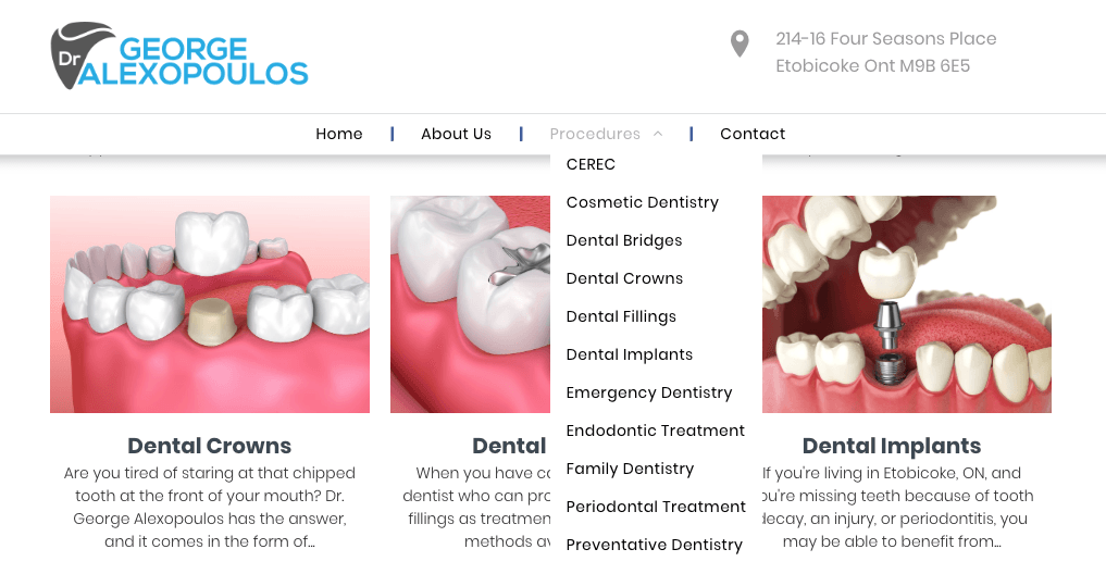
On desktops, the menu should be at the top of your page – either to the right, to the left, or centered below your logo. The menu should only contain the main titles of the pages:
- Home Page
- Services
- About Us
- Contact Us
Under each of the main titles can be dropdown menu options that link to more detailed services. For example: services > tooth extractions, teeth whitening, cleanings, etc. The menu is the map that users need to properly navigate your website.
*On tablet and mobile, the menu should be on the top right corner and be enabled as a drop-down menu. Most people are right hand dominant while using handheld devices, and this has proven to be the optimal position.
Balance
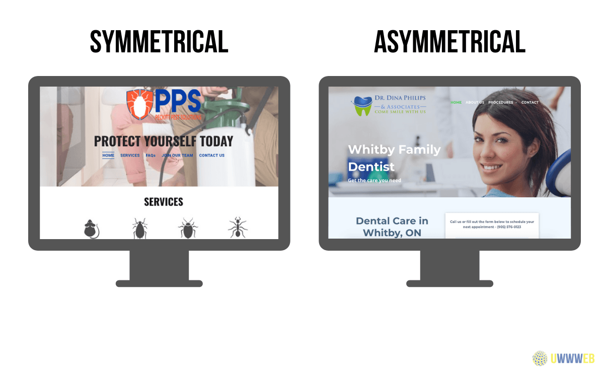
Keep the visual design balanced. If you have a picture on the page, information describing it should be directly beside or below it. You can have either symmetrical balance or asymmetrical.
Symmetrical – there is an equal number of elements or design features on either the horizontal or vertical landscape. The design should look pretty basic and straight forward. Most of the content is typically centered in the middle with a decent gap on each side. When creating this design, it’s best to use a grid to perfectly map out the elements.
Asymmetrical – the complete opposite of symmetrical design. This design might seem a bit more scattered, but trust us, there is a method behind the madness. It’s a great way to draw attention to specific content or design elements.
No matter which type you choose, the balance of your website is a feature you don’t want to neglect. It can enhance the entire user experience. It can also help set your brands aesthetic and values. For more professional businesses, a symmetrical layout is best – but for businesses with room for creativity, an asymmetrical design might help attract more clients and set you apart from your competition (from a design prospective).
Don’t Be Afraid of Blank Space
Now after you’ve completed your first design draft, take a step back and simplify. We tend to over include information when writing, especially when it’s something we’re familiar with or passionate about – But when it comes to website design, the simpler the better! More importantly, white space attracts the eye. If you have a piece of content that you really want to stand out, you might want to set it apart in a blank area. This tends to work best for a contact or appointment request form.
Color Scheme/Theme
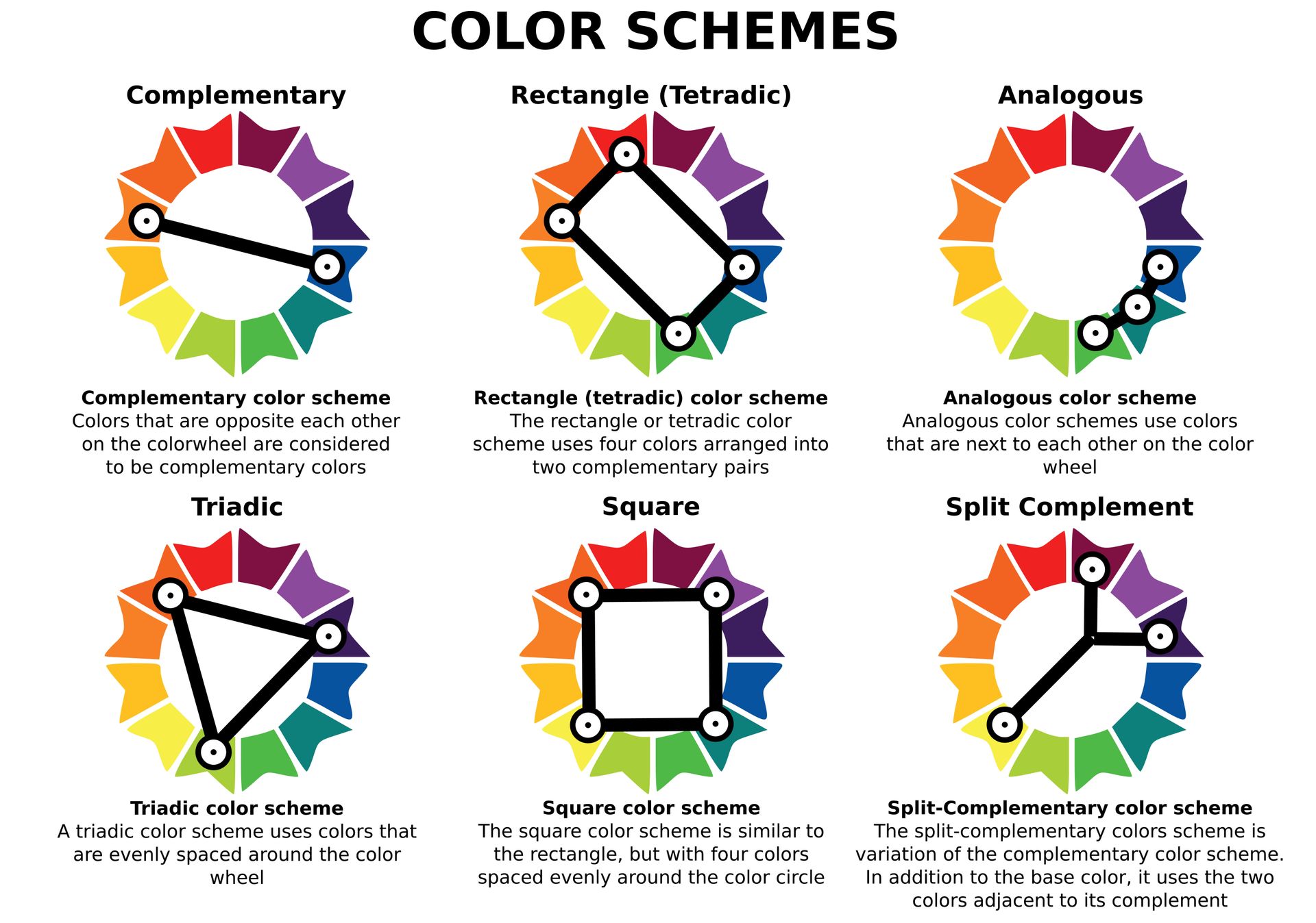
Color is everything when it comes to design! Your website should reflect your brand's colors (the colors used in your office, logo, or business documents). There is phycology behind the color scheme, and if you haven’t already decided on your branded colors you might want to put some thought into it. Talk to a branding expect at Dr. Marketing for help on choosing colors - Call us by clicking the button below!
From the home page to blank space, website design is a complicated thing. If this is your first time designing a website, you might be in over your head. It takes a lot of expertise to design a website properly.There are many simple steps that can be overlooked. These steps can disrupt your website causing error codes, cause you to lose potential clients, or preventing you from ranking higher on search engines.
Not ready to take on designing your own website? Dr. Marketing offers complete website design services. Whether you have a website or don’t, we’re here to help!


