
Tips and Tricks for Creating a Stunning Logo
Creating your brands' logo is the first step to creating your brands' image. The logo can set the tone for your entire online presence. It can be one of the deciding features for a client to learn more about your business when they click on your website. Having a memorable logo can stamp your brand into the clients mind - An effective stamp can consequently adhere to a product or service. Then, the next time that client is in need, that stamp will be the first thing in their mind. But what makes an effective logo?
There are 3 types of logos:
Logo Type – is a logo that is only text. There are no images, shapes or clip art pictures within the logo
Logo Mark – is a logo that is only graphics. There is no text or wording within the logo
Combination – is a collective piece that contains both text and graphics. This is the most popular and can better help get your message across
A brands' logo is sometimes referred to the face of the brand - and after-all, don't we all want to have a pretty face? Let's take a look at some of our best Tips and Tricks for Creating a Stunning Logo for Your Small Business or Professional Practice.
Think about the Future
The world of design is always changing. We live in an era of
constantly changing perceptions and new businesses are being created daily. A
logo created with intention can evoke a need in the clients' mind.
Consequently, a logo that is timeless is just as important as the product or service
that your brand offers. When creating your logo, it’s important to think about
the future of both your business and the future of design. A timeless design
needs to encompass the market, the target audience/customer, and the brand
itself.
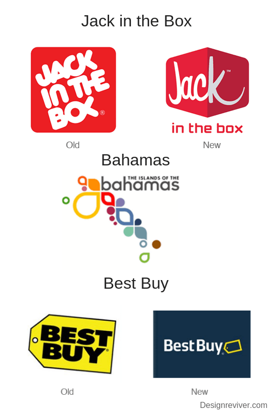
Let’s look at some of the best logo changes over the years:

Let’s look at some of the most creative logos over the years:
Pro Tips for Creating a Timeless Logo:
- Simple Design + Colors
- Easy to Read Text
- Subtle Design
- Created with a Purpose
Avoid Templates
One of the most important things to note is that a template logo will always look like a template. There are free programs with thousands of overly used logo design templates. Most of them are a simplistic shape, with the business name and one simple color. No matter how much you customize it, there are going to be others that look exactly like you. This will reflect poorly on your business and will portray a lack of effort on your side. Your brands' logo really is your time to shine, so don’t be afraid to be creative.
Some of the free programs you can use to create a logo are: Canva.com, Logojoy.com, Logomakr.com and more! Of course, if you're like most business owners and don't have time to create one, Dr. Marketing offers logo design services at a reasonable rate. Whether you're looking for word mark, pictorial mark, letter mark, emblem, combination mark, mascot, or abstract, Dr. Marketing can help design your logo with your products and services in mind.
Pro Tips for Avoiding Templates:
Take a look at some of the most popular logos in your industry. Get some inspiration and make a few sketches before you take it to the drawing board.
Hire a professional. If designing and creativity aren't your thing, there are professionals available (like us!) who create impeccably designed logos that encompass your brands mission.
Think outside of the box
Shapes and images aren’t your thing? Maybe your business is in a highly professional field, or you just simply don’t like the look of clip art and geometric shapes. A font is a new way to show your brands' personality through its logo.
There are limitless possibilities with font – all the way from handwritten to modern type. You can now even create your own font to use for your logo! You will need a few fundamental programs and a quick lesson in calligraphy and typography though. However, the end result of a logo made with custom font will stand alone and be highly impactful.
Pro Tip for Creating an All Text Logo:
- Colors are your friend
- Add in a short slogan
- Stick to 2 fonts maximum
- Understand the client (needs, demographics, skills, etc)
Make it Clear
Some brands choose to hide a hidden meaning, symbol or message in their logo. This can be interesting and compelling – it might even land your business some free marketing as it sparks a conversation. However, hiding a hidden message in your logo can easily be misconstrued. It’s important that you make it clear for individuals to understand what it means, once they’ve found it. It’s important that your hidden message or symbol only has one meaning, you, and couldn’t be considered hateful or harmful to anyone.
Let’s look at some of the hidden messages in logos over the years:
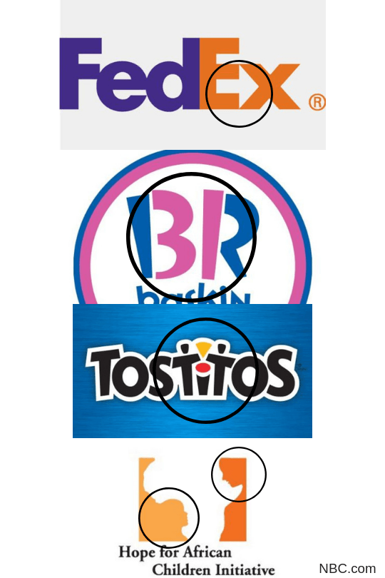
FedEx - Arrow between the 'E' and the 'X'
Baskin Robbins - 31 in between the 'B' and the 'R'
Tostitos - 2 people sharing salsa and chips in between the 'T''s and the 'I'
Hope for African Children Initiative - Africa map view and 2 faces looking at each other
Pro Tip for Adding Hidden Messages in your Logo
Review, review, review. Before you send anything to the press, get a second look at your logo without the hidden message, and ask yourself: Does it have the same (or a better) impact? Does it bring across the message I'm trying to convey?
Ask your colleagues, your audience, your family, or even your clients what you think before you make it official.
Use Complimentary Colors
Each year, Pantone sets the mood for the popular colors of the year. In 2018, the color of the year was deep purple. This influenced the popularity of darker colors like navy, forest green, grey and black to become more common in design. As each year ends, a new color is announced, so best not to follow the trending colors.
Colors also can play to different feelings and emotions. One of the most popular colors used by brands is Blue. The color Blue evokes feelings of security, tranquility, trustworthiness and can stimulate productivity. Perhaps that is the reason that some of the biggest brands use blue in their logos - like Facebook, Twitter, P&G, Dell, Samsung, IBM, Volkswagen, and so many more.
Emotions and the Colors they are Evoked by:
- Red – urgency, encourages appetite, physically stimulates
the body, raising blood pressure and heart rate, associated with movement,
excitement, and passion.
- Blue – peace, water, tranquility, and reliability, provides
a sense of security, curbs appetite, and stimulates productivity.
- Green – health, tranquility, power, and nature.
- Purple – royalty, wisdom, stimulates creativity and respect.
- Orange & Yellow –promote optimism.
- Black – authority, power, stability, intelligence, and
strength.
- Grey – practicality, old age, and solidarity. But too much
grey can lead to feelings of nothingness and depression.
- White – purity, cleanliness and safety.
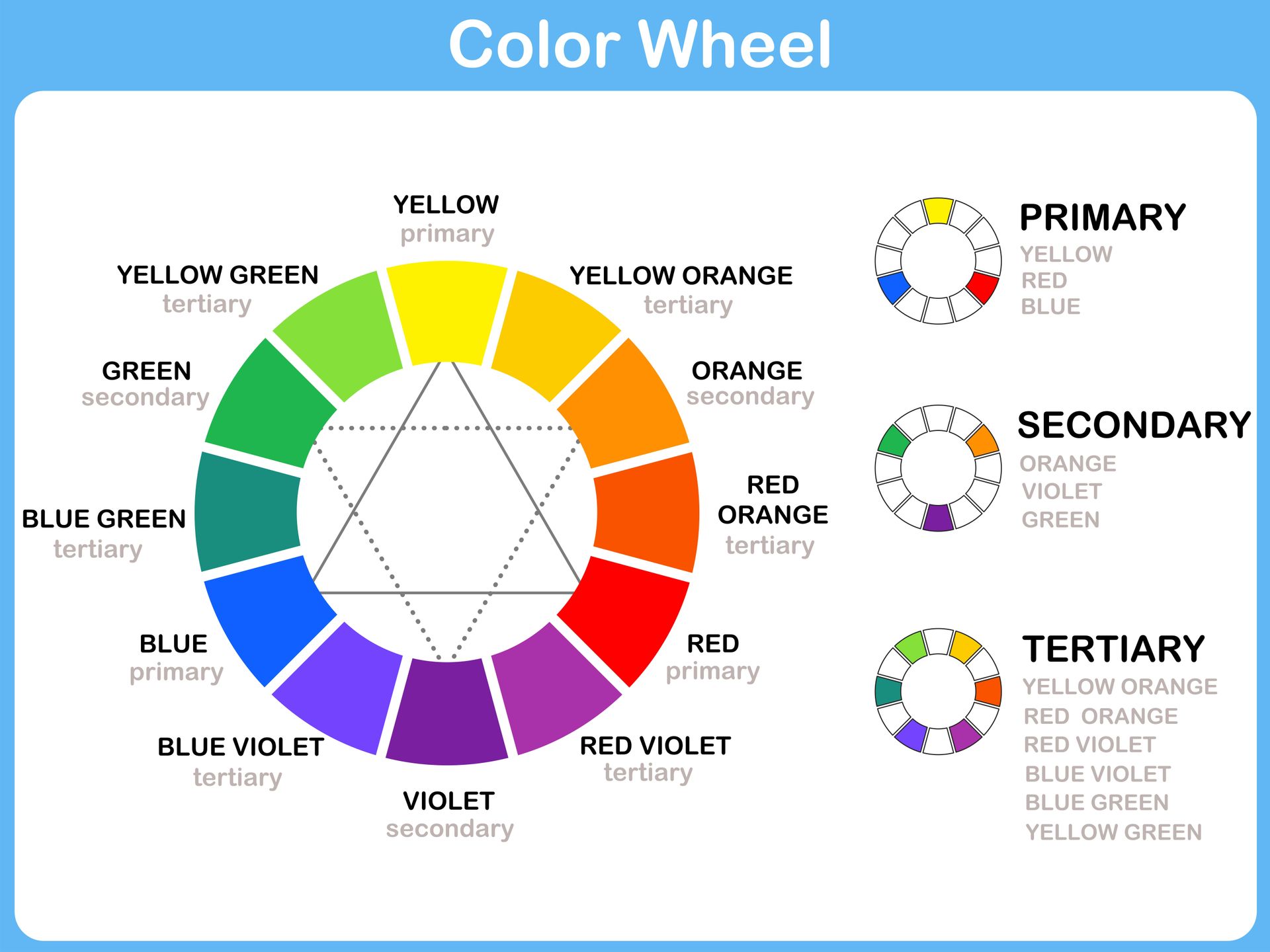
There are a few color combinations derived from the color wheel that go together perfectly. It’s best to use colors that pair well together on the color wheel. This will result in a perfectly harmonious logo.
Color Combinations:
- Pairing with the color(s) directly beside it on the color
wheel
For example, if Orange is the main color, you should pair with red to the left and yellow to the right
- Pairing with the color directly opposite on the color wheel
For example, if Yellow is the main color, pair with blue on the opposite side of the color wheel.
Pro Tips for Choosing Colors for Your Small Business Logo:
Choose a color (color combination) that encompasses your brands mission. Don’t be afraid of color, the emotional language of color might even help you in the future. If you have no idea which colors to turn to, opt for blue. Like many of the big brands have shown us, blue suggests skill, reliability, and success.
Keep it Simple
The best advice for logo design is really the simplest of all – Keep it Simple. One of the biggest mistakes that designers have, is that they overdo it. They may pay too much attention to the font styles, color choices or the hidden messages that they can hide in the logo.
Pro Tip for Creating the Perfect Logo for your Small Business
When creating your logo, you want to keep one tip in mind:
Picture yourself as an outsider, who has no idea what your business is or what you do. Then take a look at your logo. Are you able to guess what industry you are in just by looking at it? Am I able to know where you are located? Who you service?
Your logo should give potential clients a general idea about who you are. Keep in mind that your small business is also your brand – and the logo is the first step in defining your brand to the client. Make sure that your logo gives your clients the confidence to put their trust in you.
Don’t be Afraid to Get Creative
Just because we’re saying to keep it simple, doesn’t mean that you can’t be creative! Let your creative juices flow and create something one of a kind. Just be sure that:
- You will still like it in 5 years
- Your clients will understand the message
- Users will know what field you are in and/or what your business is about
If you're stuck in your logo design and have no idea where to start, give us a call – we gotchu’. Logo design is one of our many areas of expertise. We’ve created hundreds of unique logos for our clients, all of which have all set the tone for their online presence.
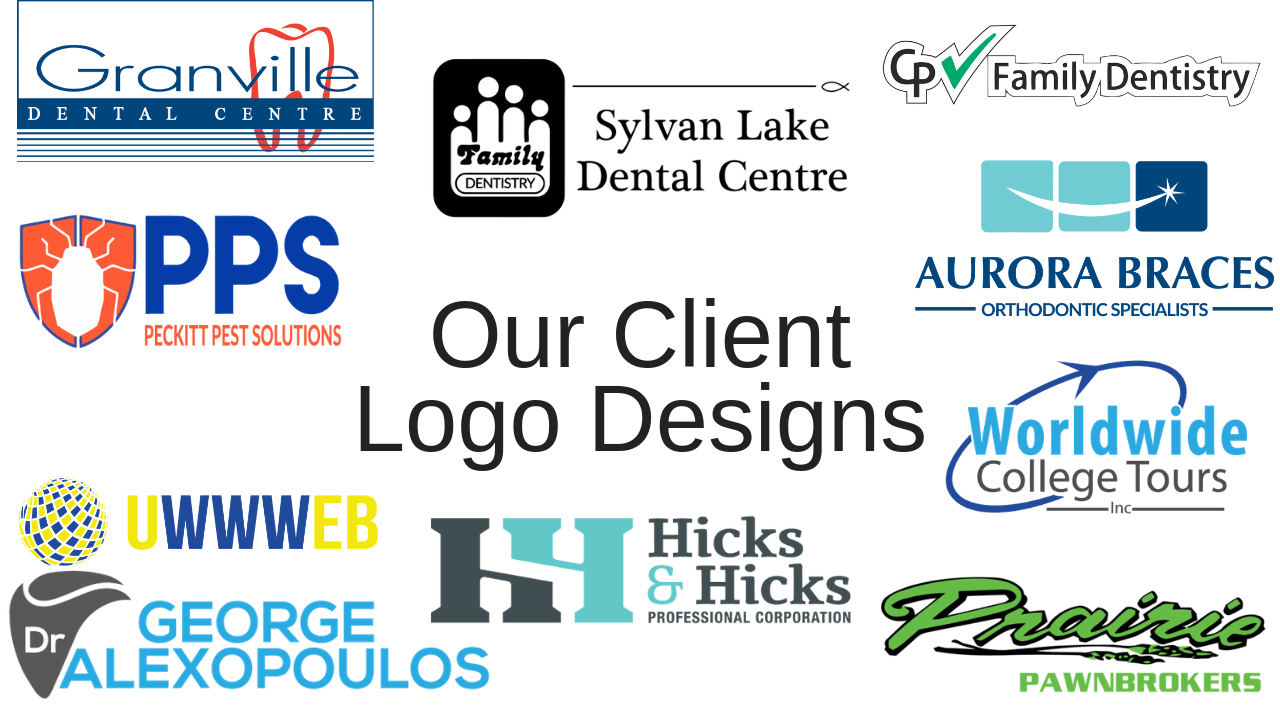
Check out some of our favorite logo’s that we’ve designed for our clients.
Which one is your favorite? Comment below!